
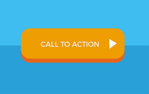
If you used Call To Action (CTA) for that purpose, then you are on track! Also known as CTA, are calls to action used throughout the various stages of the conversion funnel, as they allow you to call the attention of your visitors to a certain action. They appear mostly in button format or link, with imperative verbal tense ("Call now", "Download now") and are used to convert visitors to customers or potential customers through design, content, shapes, colors and final action.
Each company, website, blog or social network must define the Call To Action according to the final conversion goal (eg purchase, download, subscription, registration, etc.), also taking into account: analysis of the results and the path of the visitor/follower until the end of the process.
#1 Encourage click
In order for the visitor to click on your CTA, your products or services must respond to their problem or need by communicating the respective benefits. But should also stay focused! Too many CTAs confuse and distract the visitor and do not allow him to get the expected results since the task of analysis and monitoring is difficult.

#2 Direct language
Disclosing discounts and offers through CTA, captures the interest and attention of the visitor, however, remember: always use an imperative language (eg.: call, buy, subscribe, sign up, sign in, etc.) and according with the contents presented.
Tip I: create a sense of urgency and/or need in the visitor, eg.: "Limited to the first 100 entries", "Exclusive offer for founding members", "Now 150€, before 300€".
Tip II: Avoid using more than five words in a CTA.
#3 Avoid visual noise
Filling your page, blog, or social network with too many visuals, content, banners or other types of communication will cause your CTA to be hidden or concealed. Releasing some space around your CTA will allow you to attract more attention to it, because the more blank (or empty) around Call To Action, the more focus and likelihood of clicking.
#4 CTA Color and Size
Depending on your conversion goal, the size and color of the CTA influence the visitor's behavior. That is if you use colors that are too similar to those of your website, blog or page, Call To Action will not have any highlighting, as well as if it is the same size as the other textual elements.
#5 Use CTA in different places
Do not be afraid to use a call to attention as long as you do it correctly and programmed. The pages of your website, blog and emails must have their CTA, allowing the visitor to continue the purchase process, be it initial, intermediate or final. When presenting CTAs on your website, your goal is to generate leads, turn your visitor into an end customer, through a free App, an eBook download, an exclusive campaign, free subscription, and more.
Your blog, as a promotional tool for your products and services, is the ideal place to influence the purchase through a call related to the content.
But we did not stop here! You can and should also include a CTA in your emails and newsletters! Because as personalized communication channels, they allow you to direct the attention call to the target you want, increasing the chances of clicking.
#6 Types of CTA
According to the type of service or products you offer, the CTA must go against them and always be related to the contents (graphics and semantics) presented.
- Provide an incentive: through exclusive access to information and social influence (eg.: a free online course, immediate discount, testimonials);
- Show the product: create a tangible relationship between the products and services you offer and the visitor to your website, page or blog (eg.: provide a representative example);
- Appeal text: in some cases, it is appropriate to add complete information to your CTA (eg.: "Start the course already and receive an international certificate", "See how we can improve your online presence");
- Guide the visitor: indicate the way to go to the CTA, that is, display arrows, icons, etc. (eg.: ->);
- Increase the database: show that your company and brand have added value and that the visitor will have numerous advantages in subscribing to your newsletter or registering for more information;
#7 Split Testing
It is important that you identify which CTAs bring you the highest return, so you should test the colors, sizes, and content used.
CHECK LIST:
- Define a communication strategy and its objectives
- Structure the content to be presented
- "Less is more": be direct and assertive
- Create whitespace around the CTA
- Use different colors than your website, company or brand
- Present content in a logical and orderly way
- Do not use more than 5 words
Now that you know the importance of CTAs, what are you waiting for to get results?!
Share your experience and/or questions with us through 262 400 643 or geral@double.pt, together we do the #Double of the deals! ;)